01 Introduction
Developing a Budget Friendly Tool Tailored for Young Adults
Proximity is an app I developed to help college and school students easily find budget-friendly local events. It was created as part of my coursework in Human-Centered Design (HCDE 302 & 303). Over 20 weeks, our design process moved through research, ideation, design, and development to bring this idea to life.
Problem
Addressing the Struggle of Finding Relevant Activities
As students, we often found ourselves struggling to find free or affordable activities that actually matched our interests. Whether it was unclear event details, scattered information across multiple platforms, or just not knowing where to start, we realized this wasn’t just our problem—our friends and classmates were dealing with the same frustration. It shouldn’t take endless scrolling and multiple apps just to find something fun to do.
That’s when we decided to dig deeper to understand the issue and find a solution that actually works.
Product video
Helping Students Discover Free Activities and Events Nearby
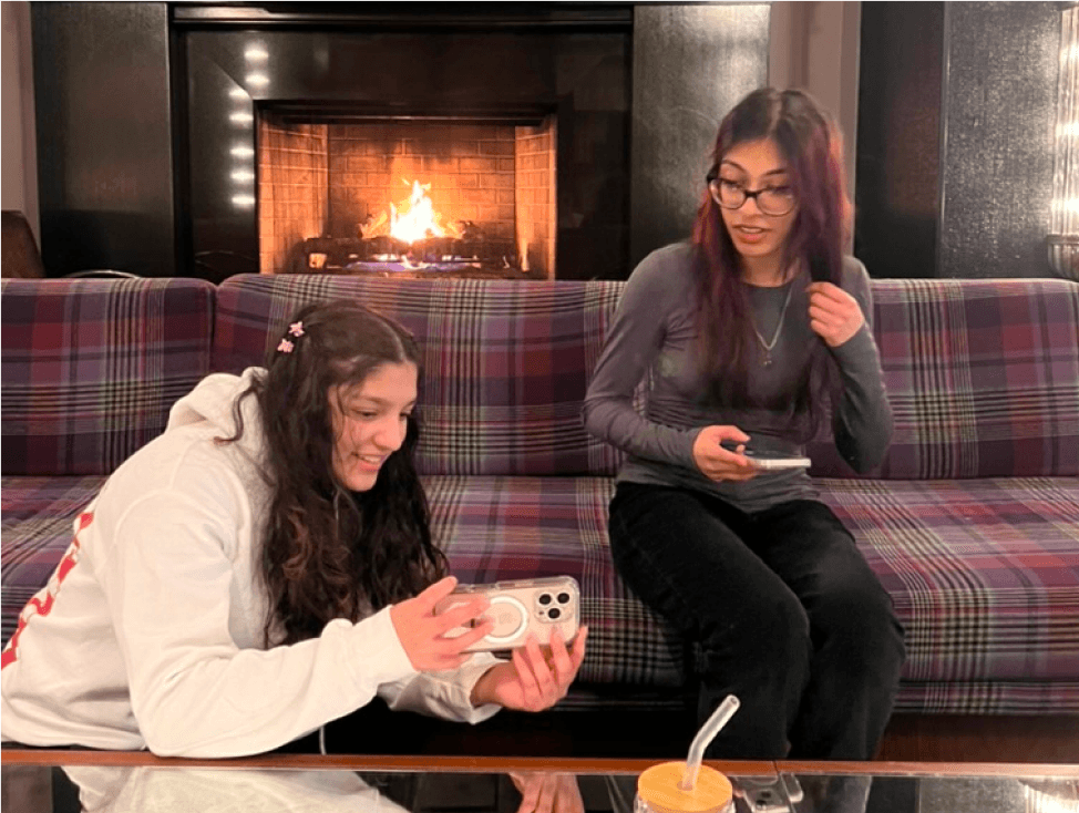
This video demonstrates a typical user of the Proximity app and how they would interact with the three unique features of the app.
In “Paisley Meets Proximity,” a Proximity user named Paisley is new to UW. She heard about the Proximity app during the Dawg Daze welcome week on campus. After downloading it, she receives a notification for an upcoming event. She RSVP’s and goes to the event. After becoming a frequent user of the app, she unlocks the ability to upload other event posters on the app, so she uploads an event for her club. Another student, Phoebe, gets a notification for the event and the two meet at the event.
Watch the video to see a demonstration of our App
02 Research
We started our research by looking at competitor apps to understand what was already out there and what gaps existed. From there, we conducted user interviews to hear firsthand about the challenges people faced when finding local events. Analyzing this data gave us a clearer picture of our users’ behaviors and needs, which we then used to create two personas that guided our design decisions.
Competitor Analysis
Most apps have features hidden behind paywalls, making it inaccessible for students
We analyzed four competitor products: Meetup, Nudge, Bumble BFF, and bulletin boards. Our analysis of these products helped frame our goals for our solution and the rest of our research.
Findings
The paywall present in all three apps was the most noticeable weakness in these competitors.
Most competitors lacked features for how to fit an activity into the user’s personal schedule.
Most of these products relied on user’s previously stated interests. This was helpful to provide the user with events that they would find interesting.
Interviews
Participants were frustrated with Finding Relevant Activities and Clear Event Details
We conducted five total interviews. Our inclusion criteria was people of the age range 16 to 26 who live in Seattle. Two of our participants were UW students and two were UW graduates
Findings
80% Participants wanted to find activities that suit their interests and hobbies, ideally, other attendees of events would also have similar interests.
60% Participants ran into challenges when searching for reliable and efficient information about an event, unclear logistics was a commonality.
80% Participants want to do activities but don’t have the energy to find and participate.
Personas
Bringing Our Users to Life
To make sense of our research findings and ensure our design decisions addressed real user needs, we created two personas based on energy levels we observed to help us stay focused on designing a solution that would make finding and attending events easier for a range of users.


03 Ideation
Exploring the Problem Space
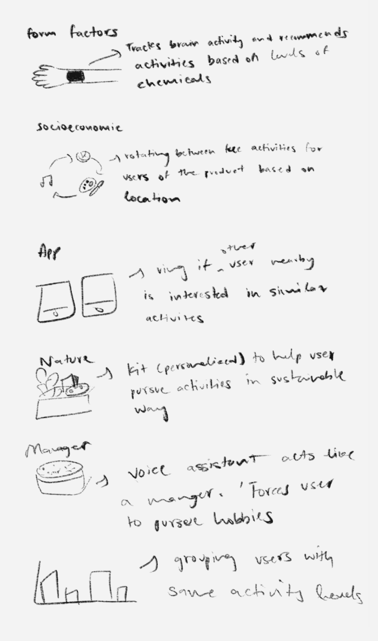
Before jumping into solutions, we thought about key factors like energy, budget, location, motivation, and ease of use. We brainstormed a wide range of ideas—both digital and physical—without worrying about constraints to explore all possibilities.
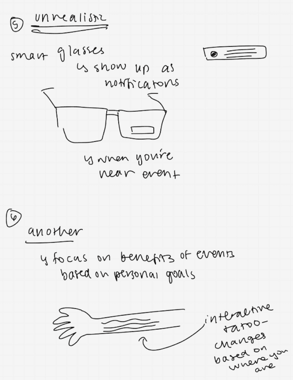
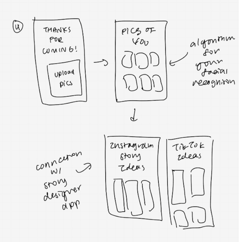
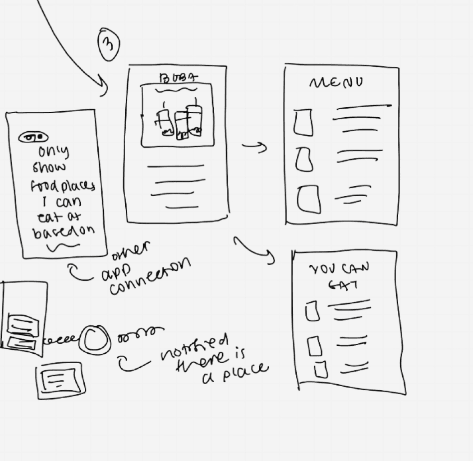
Initial idea sketches
Considering Multiple Factors to Guide Our Ideas
To bring our ideas to life, we sketched different concepts for how Proximity could work. These early sketches helped us think through event discovery, scheduling, and interactive features. From there, we refined our ideas based on user needs and research insights.

ideation matrix
Narrowing Down Our Ideas
With only 20 weeks for the project, we needed to quickly narrow down our ideas. After brainstorming a wide range of solutions, we ranked them using a numeric scoring system based on key factors from our research—like affordability, ease of use, and clear event details. This process led us to our top concept: an app that helps users find free activities.
Goals
After deciding on our app concept, we set two design goals to ensure our solution directly addressed the needs we uncovered in our research. These goals helped us stay focused as we moved into the design phase.
1
Easy and straightforward to receive information about events that fit into users’ schedules.
2
Low budget activities and events are prioritized to ensure that users on a budget are supported.
storyboard
After setting the design goals, we created a storyboard to show how the app fits into a real user's experience. We followed Sarah, one of our personas, as she uses the app to find and attend an event. This helped us understand her journey and identify important design considerations.

04 Design
Our design phase began with initial sketches of how information would be organized within our app. Based on this architecture, we sketched wireframes and then conducted a series of usability testing sessions and iterations of our wireframes before they reached high-fidelity.
information architecture
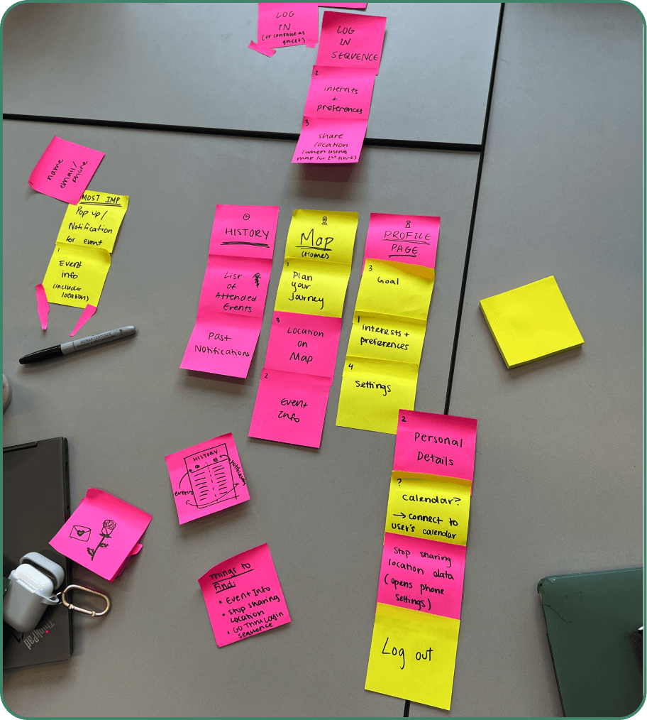
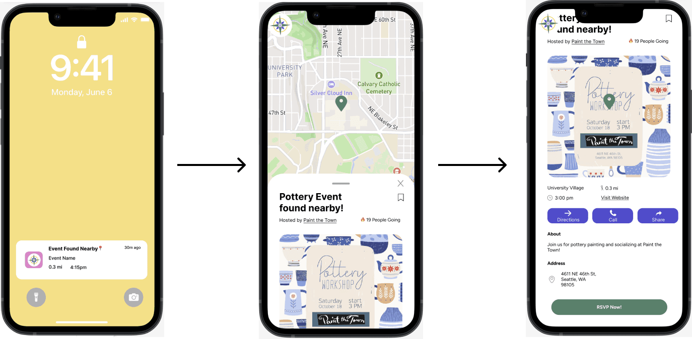
Our information architecture allows users to be notified of events and activities that are near their current location. It is crucial that users share their location with the application in order to receive event suggestions. After logging in, the app opens to the Home page with a map showing nearby events. If a user enters the app via clicking on a notification on their lock-screen, then the app will open to a pop-up on the Home screen with more information on the event.
We included a more thorough information architecture diagram below.


Concept Sketches
After finalizing our information architecture, we individually sketched out concepts for what Proximity’s UI could look like.

Low fidelity prototype
Taking Our Concept and Giving it Form
After reviewing everyone’s designs, we picked the best features for the Home, Search, and Profile pages and combined them with our vision for the lo-fi prototype. We also created flows for these pages to cover all interactions and move into the next stage of prototyping.

Concept Testing
Refining Our Prototype Based on User Input
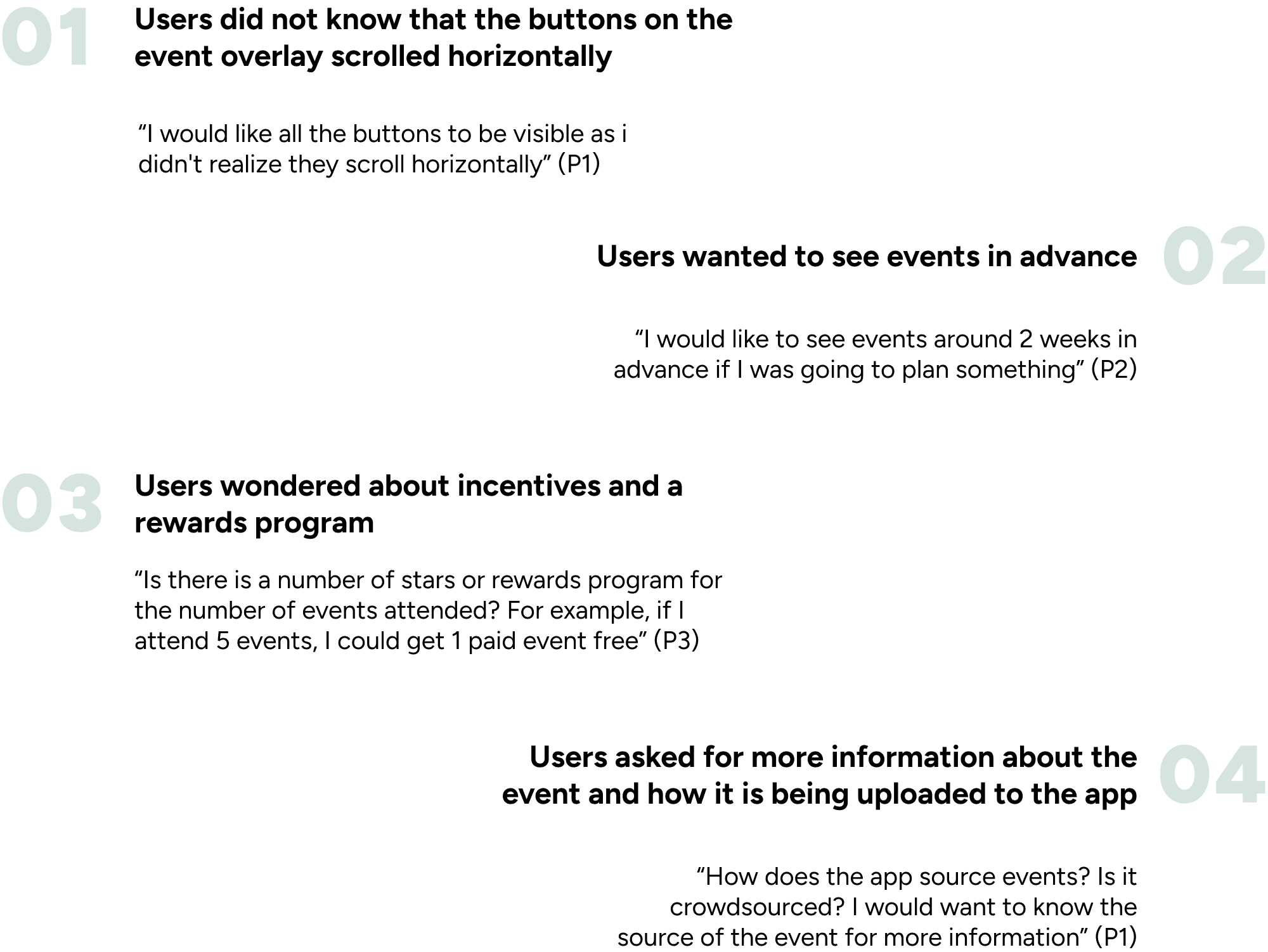
Before moving on to the mid-fidelity stage, we tested our low-fidelity prototype with four users to make sure we were on the right track. We found that users didn’t recognize some buttons, wanted to see events ahead of time, suggested a reward system, and wanted more information on how to upload content. These insights helped us decide what to focus on next.
Mid Fidelity Prototype
Changes We Made to Our Prototype (I)
Removed horizontally scrolling buttons
Added a search and filter option to address concerns about seeing events in advance
Added a way for users to adjust how far in advance they receive notifications for events
Introduced a new feature for scanning event posters that is only available to verified users and organizations
Addressed concerns about how events are uploaded to the app by including the scanning feature
Created a style guide, color palette, and logo for our app to ensure that branding is consistent
Notification Pathway
Map Homepage Filters

'Plan Your Journey'

Search
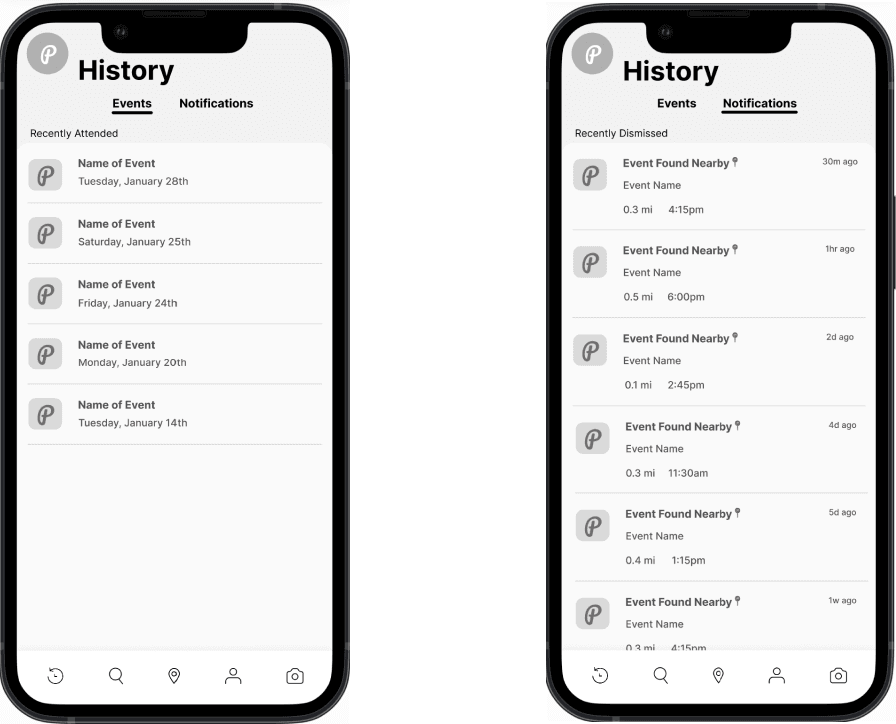
History
Profile

Usability testing
We conducted usability testing of our mid fidelity prototype by asking users to complete four tasks within the app. We asked users to think aloud and observed how they were navigating the app interface. Each team member conducted a session with one participant for a total of four participants. This was another point of contact with our users that helped us refine our prototype to meet high-fidelity requirements.

Changes We Made to Our Prototype (II)
Ensured that all back buttons and buttons in general are uniform, including that there is a way to navigate backwards or exit from every page
Improved the map functionality on the home page and when filtering events.
Improved the ‘Plan your Journey’ pathway as users did not understand the purpose of it and found it hard to navigate through.
Removed the searching part of the Plan Your Journey, and moved the button into event details.
Made the UI style consistent throughout the app, including text styles, color, sizing, spacing, and margins.
final design!
Bringing It All Together
This project has been a rewarding 20-week journey, from start to finish. Throughout this time, we’ve learned, iterated, and collaborated to refine our ideas. We’re excited to showcase Proximity as the result of all our hard work.

Home Screen
The home page lets users see event pins on a map and scroll through upcoming popular events. They can filter events using the options in the top right corner to tailor the map to their preferences.
Event Details
Clicking on an event shows all the necessary details, and users can RSVP, contact the organizer, or see how many people are attending.


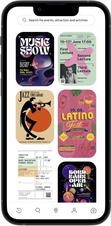
Search Page
The search page lets users find events without the map, showing a list of events. All events are free to ensure that everyone can attend.
Uploading an Event
Verified users can upload their own events, making it easy for the community to share opportunities with each other.


Set an Event Goal
We encourage users to set goals, providing incentives to keep them motivated to attend events and stay engaged.
05 REFLECTION
06 OUR TEAM